WEST RYLTY PROPERTIES
Context
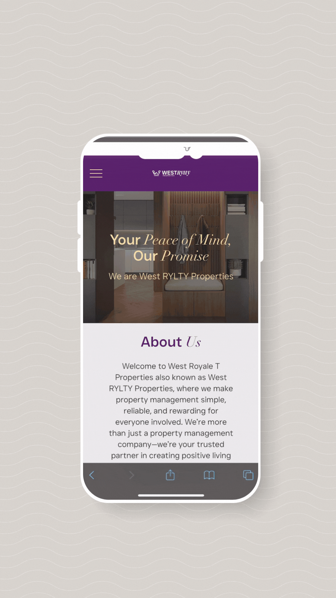
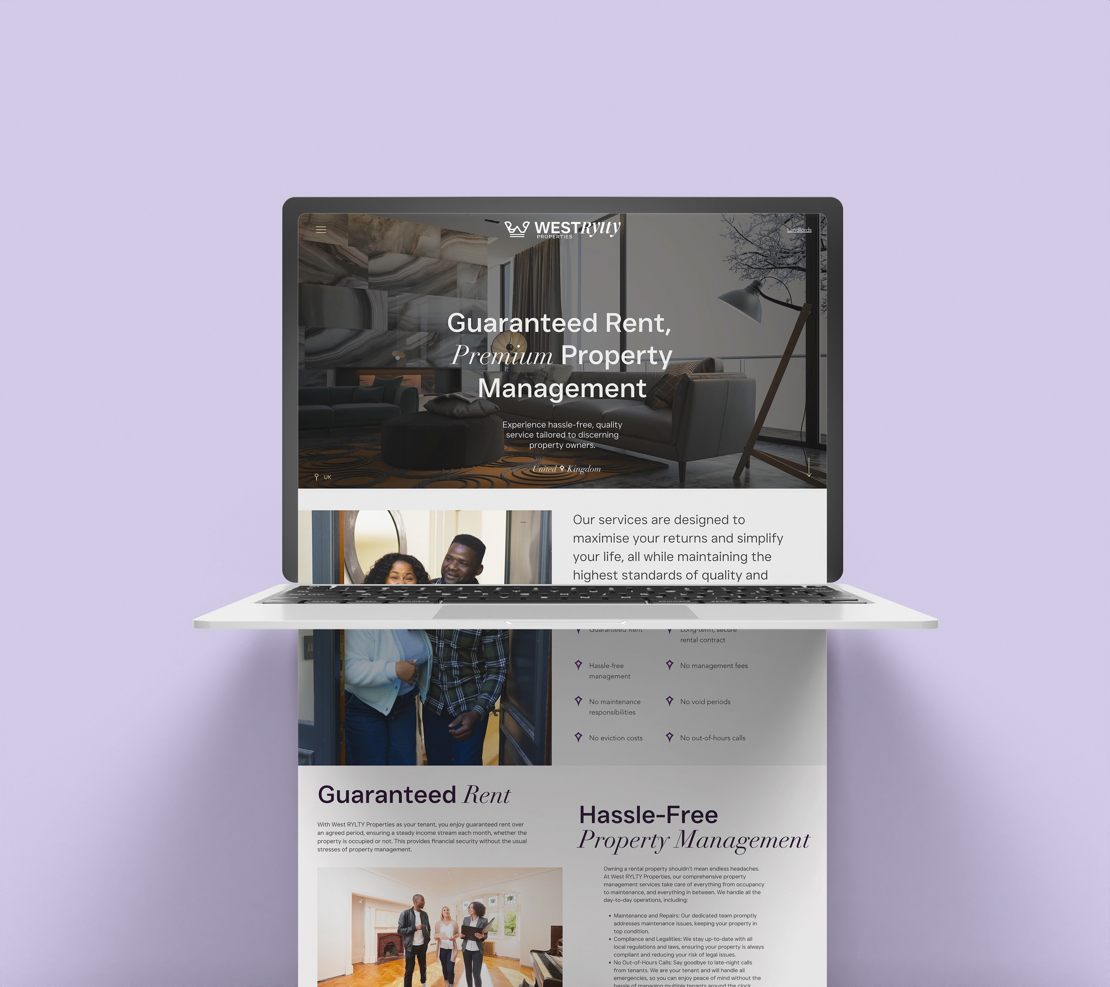
West Rylty is a property business operating within the rent-to-rent model, offering tailored solutions to landlords seeking trustworthy, high-quality property management. I was commissioned to design a complete brand visual identity, brand guidelines, and website, focused on landlords as the core audience. While the website currently targets landlords only, West Rylty ultimately aims to become the bridge between landlords and young professional guests in search of aspirational, comfortable living. The identity needed to communicate professionalism, ease, and reliability while still reflecting the warmth and ambition behind the founder’s vision.
ART DIRECTION
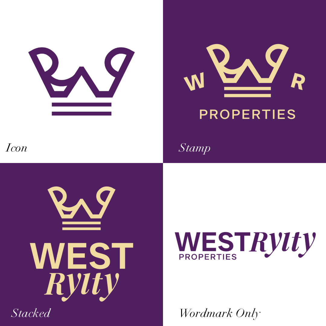
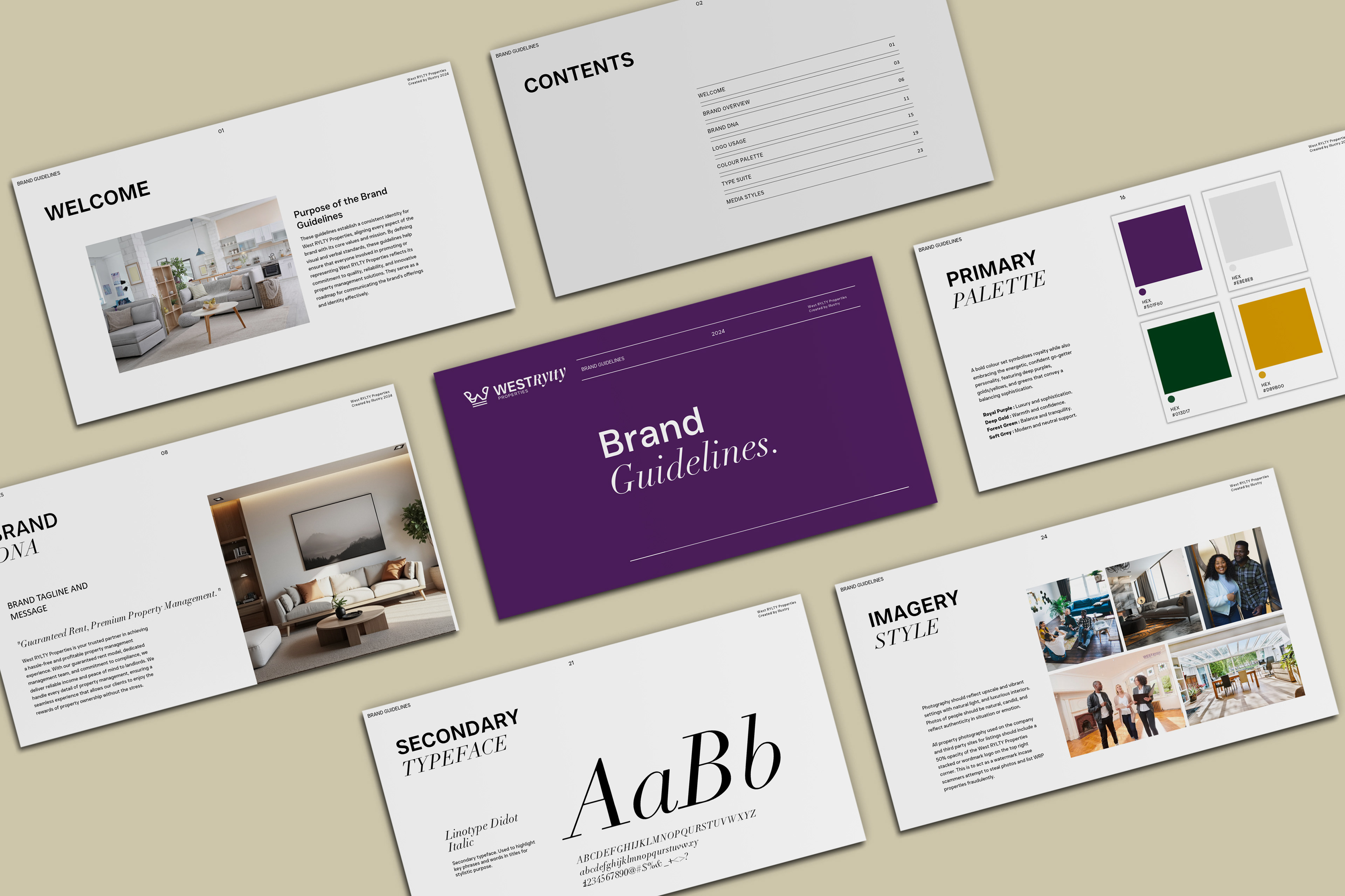
The creative direction leans into a bold and elevated aesthetic, blending regal undertones with modern cues to reflect both luxury and approachability. The brand’s deep purple and gold palette nods to themes of royalty and legacy, while a geometric crown icon offers a versatile brand asset with meaning and memorability. A contrast of serif and sans serif typography was introduced to balance tradition with clarity. The website was designed to be sleek, intuitive and mobile-first, helping West Rylty position itself as a property brand that values both visual appeal and user experience.